10 Easy Projects for Exploring Color Theory
Are you ready to embark on a colorful journey of creativity and exploration? In this article, we will delve into 10 easy projects that will not only ignite your passion for art but also deepen your understanding of color theory. These hands-on activities are perfect for beginners and art enthusiasts alike, offering a fun and educational way to discover the magic of colors.
Let's kick things off with the classic Color Wheel Creation project. By mastering the primary, secondary, and tertiary colors, you will unravel the secrets of warm and cool hues, as well as delve into the fascinating world of complementary and analogous color schemes. Get ready to spin the wheel of creativity!
Next up, we have the intriguing Monochromatic Painting experiment. Dive into the realm of shades and tints as you explore the subtle variations in value and intensity of a single color. Witness how monochromatic schemes can wield a powerful impact on your artistic expressions.
For a hands-on experience, try your hand at Color Mixing with Playdough. Blend primary colors together to unveil a spectrum of secondary colors, all while getting a tactile feel for the basics of color mixing. Watch in amazement as different hues merge to form a kaleidoscope of possibilities.
Ready to get crafty? Create a Color Harmony Collage that showcases various color harmonies like complementary, split-complementary, and triadic schemes. Witness the magic that unfolds when colors interact harmoniously in visually captivating compositions.
Delve into the world of gradients with a Gradient Study. Blend colors seamlessly to grasp the nuances of value transitions and how gradients can infuse your artwork with depth and dimension. Explore the art of subtle blending and bold contrasts.
Feeling fashion-forward? Design a statement outfit with Color Blocking Fashion Design. Experiment with bold and contrasting color combinations to create a visually striking ensemble. Discover how strategic placement of colors can transform a simple design into a work of art.
Unravel the mysteries of color psychology with a Color Psychology Mood Board. Curate a board that elicits specific emotions through carefully selected colors. Explore how different hues can influence mood, behavior, and perception in profound ways.
Connect with nature through a Nature-Inspired Color Palette project. Take a stroll outdoors to gather inspiration from the vibrant hues of the environment. Immerse yourself in the beauty of natural colors and translate them into your artistic creations.

Color Wheel Creation
Discover fun and educational projects that will help you understand the principles of color theory through hands-on activities. Perfect for beginners and art enthusiasts looking to enhance their understanding of color relationships and combinations.
Creating a color wheel is a fundamental exercise in understanding color theory. By using primary, secondary, and tertiary colors, you can grasp the relationships between different hues. Imagine the color wheel as a clock, with each color representing a specific hour. Mixing these colors allows you to explore warm and cool tones, as well as complementary and analogous color schemes that harmonize beautifully.
Monochromatic Painting
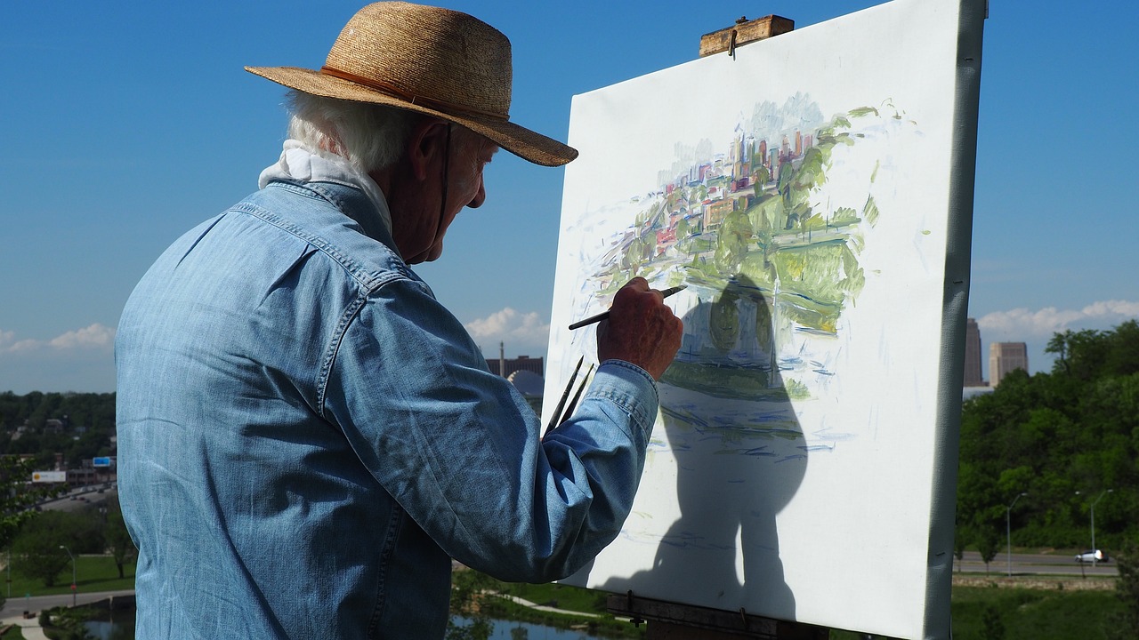
When it comes to exploring color theory, one of the most engaging projects you can undertake is monochromatic painting. This technique involves using different shades and tints of a single color to create a visually striking piece of artwork. By experimenting with variations in value and intensity, you can discover the power and versatility of monochromatic schemes.
Imagine diving into a world where a single color takes center stage, showcasing its depth and richness through subtle nuances and bold contrasts. With monochromatic painting, you have the opportunity to explore the full spectrum of a color, from its darkest shades to its lightest tints, all within the confines of a unified palette.
Through the process of monochromatic painting, you can learn how to manipulate color to convey different moods and emotions. By playing with light and shadow, you can create depth and dimension in your artwork, drawing the viewer's eye into a captivating visual experience.
Consider the artistry involved in using various tones of a single color to evoke feelings of serenity, drama, or mystery. Each brushstroke becomes a deliberate choice, adding layers of meaning and expression to your painting. As you explore the subtleties of monochromatic schemes, you'll uncover new possibilities for self-expression and creativity.
Experimenting with monochromatic painting is not just about mastering a technique; it's about delving into the essence of color itself. By immersing yourself in the world of a single hue, you can deepen your understanding of color relationships and the impact of light and shadow on visual perception.
Color Mixing with Playdough
Discover fun and educational projects that will help you understand the principles of color theory through hands-on activities. Perfect for beginners and art enthusiasts looking to enhance their understanding of color relationships and combinations.
When it comes to understanding color mixing, there's no better way to grasp the concept than with a hands-on approach. By using playdough, a versatile and colorful medium, you can explore the magic of combining primary colors to create secondary hues.
Imagine a world where red, blue, and yellow come together to form a spectrum of new shades. With just a pinch of creativity, you can witness the transformation of colors right before your eyes. It's like being a mad scientist, but instead of potions, you're concocting vibrant hues that dance in harmony.
Through the tactile experience of kneading and blending playdough, you'll learn how different colors interact and influence each other. It's a playful journey of discovery where every twist and turn reveals a new color possibility. As you mix and mold, you'll uncover the secrets of color theory in a fun and engaging way.
Picture yourself rolling out a rainbow of colors, each one more mesmerizing than the last. From subtle pastels to bold primaries, the playdough becomes your canvas, and your fingers the brush. With each blend, you'll witness the birth of a new shade, a testament to the endless possibilities that color mixing offers.
So, grab your playdough and let your imagination run wild. Dive into the world of color mixing, where creativity knows no bounds and surprises await at every turn. Who knew that a simple activity could hold the key to unlocking the wonders of the color spectrum?
Color Harmony Collage
Creating a Color Harmony Collage is a delightful way to explore the dynamic interplay of colors in art. By combining images and materials that showcase various color harmonies, you can visually experience the magic of complementary, split-complementary, and triadic schemes. Imagine blending vibrant reds with calming blues, or pairing energetic yellows with soothing greens to see how colors interact and influence each other in a composition. It's like orchestrating a symphony where each color plays a unique role in creating a harmonious visual experience.
Gradient Study
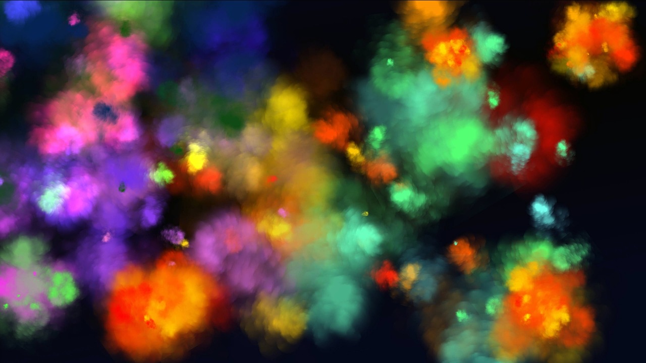
Exploring gradients in art is like uncovering a hidden treasure chest filled with mesmerizing color transitions. Imagine seamlessly blending two or more colors together, creating a visual journey from light to dark or from one hue to another. Gradients are the secret ingredient that adds depth and dimension to your artwork, making it come alive with a sense of movement and energy.
When diving into a gradient study, you embark on a quest to master the art of smooth color transitions. This technique allows you to play with the intensity and saturation of colors, creating a dynamic range of tones that captivate the viewer's eye. By understanding how colors interact and blend harmoniously, you can elevate your artwork to new heights.
One fascinating aspect of gradients is their versatility. They can be applied in various art forms, from digital design to traditional painting. Whether you're exploring a soft transition between pastel shades or a bold shift from vibrant hues, gradients offer endless possibilities for artistic expression.
Imagine a sunset painting where the sky seamlessly transitions from a warm golden glow to a deep, rich purple. The gradient technique allows you to capture the beauty of this natural phenomenon, creating a sense of tranquility and awe in your artwork. By mastering gradients, you can evoke emotions and tell stories through the seamless fusion of colors.
Color Blocking Fashion Design
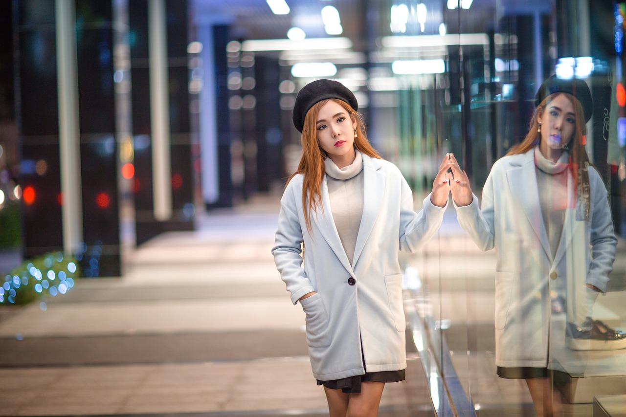
Color blocking in fashion design is a bold and creative technique that involves using contrasting colors in distinct blocks or sections of a garment. It's a popular trend that adds vibrancy and visual interest to outfits, making them stand out in a crowd. By strategically combining different hues, designers can create striking looks that play with color juxtapositions and create a dynamic visual impact.
Imagine a canvas where each color block is like a puzzle piece, fitting together to form a cohesive and eye-catching design. Just like a painter selects colors to create a masterpiece, fashion designers carefully choose contrasting shades to construct unique and modern clothing pieces. Color blocking allows for endless possibilities in mixing and matching colors, offering a fresh and contemporary approach to styling.
When experimenting with color blocking, consider the color wheel and how different shades interact with each other. Pairing complementary colors like blue and orange or yellow and purple can create a striking contrast that catches the eye. Alternatively, using analogous colors that are next to each other on the color wheel, such as blue and green or red and orange, can result in a harmonious and cohesive look.
To master the art of color blocking, start by selecting a color palette that resonates with your personal style and the mood you want to convey. Whether you opt for a bold and energetic combination or a more subtle and sophisticated mix, the key is to balance the colors in a way that enhances the overall aesthetic of the outfit. Experiment with different color proportions and placements to find the perfect balance and create a visually impactful ensemble.
Color Psychology Mood Board
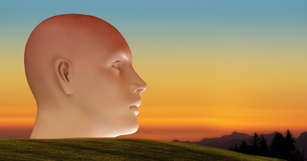
Creating a color psychology mood board is a fascinating way to explore the emotional impact of colors in design and art. By carefully selecting hues that evoke specific feelings and moods, you can create a visual representation of how different colors can influence our perceptions and emotions.
When designing a color psychology mood board, consider the meanings associated with each color. For example, warm tones like red and orange are often linked to energy, passion, and excitement, while cool tones like blue and green are associated with calmness, tranquility, and nature. By combining these colors thoughtfully, you can convey a range of emotions and create a harmonious visual experience.
Think about the overall message or theme you want your mood board to communicate. Are you aiming for a board that exudes positivity and joy, or one that conveys serenity and relaxation? By curating images, swatches, and textures that align with your chosen color palette, you can effectively convey your desired mood and create a cohesive visual narrative.
Consider the context in which your mood board will be viewed. Different colors can have varying effects depending on the cultural background, personal experiences, and individual preferences of the viewer. By being mindful of your audience and the intended message of your mood board, you can craft a compelling visual story that resonates with others.
Nature-Inspired Color Palette
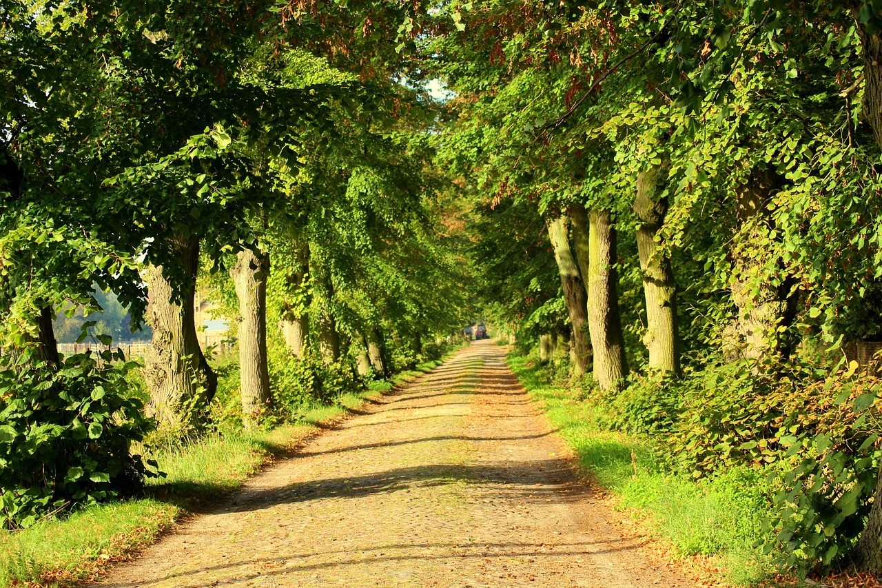
When it comes to exploring color theory, drawing inspiration from nature can be a truly enriching experience. Nature offers a vast array of colors, textures, and patterns that can spark creativity and provide endless possibilities for creating a unique color palette. By taking a leisurely stroll through a park or a hike in the mountains, you can observe the rich hues of blooming flowers, the earthy tones of tree bark, and the vibrant shades of a sunset.
One way to capture the essence of nature in your artwork is by creating a color palette inspired by the natural world. Imagine the deep greens of a forest, the warm browns of a sandy beach, or the soft pastels of a spring garden. By carefully selecting and arranging these colors, you can create a harmonious palette that reflects the beauty and diversity of the outdoors.
Consider creating a mood board with images of nature scenes that inspire you, such as a tranquil lake surrounded by lush greenery or a breathtaking mountain landscape at sunrise. Use these images as a reference to identify key colors that resonate with you and evoke a sense of peace, serenity, or excitement.
Experiment with combining different shades and tones to capture the nuances of nature's color palette. Mix earthy browns with leafy greens, or add pops of vibrant flowers against a backdrop of sky blues. By playing with light and dark values, you can create depth and dimension in your color palette, much like the interplay of light and shadow in a natural setting.
Ultimately, creating a nature-inspired color palette allows you to bring a piece of the outdoors into your artwork, infusing it with the beauty and tranquility of the natural world. Whether you're a seasoned artist or a beginner exploring color theory, drawing inspiration from nature can open up a world of possibilities and ignite your creativity in unexpected ways.
Frequently Asked Questions
- What is color theory?
Color theory is a set of principles that explores how colors interact with each other and how they can be combined to create visually appealing compositions. It helps artists and designers understand the relationships between colors, their properties, and the emotions they evoke.
- Why is color theory important?
Understanding color theory is crucial for artists and designers as it allows them to make informed decisions about color choices in their work. It helps in creating harmonious color schemes, conveying specific messages or emotions, and enhancing the overall visual impact of a piece.
- What are primary, secondary, and tertiary colors?
Primary colors are the base colors that cannot be created by mixing other colors - red, blue, and yellow. Secondary colors are formed by mixing two primary colors - orange, green, and purple. Tertiary colors are created by mixing a primary color with a neighboring secondary color.
- How can I apply color theory in my artwork?
You can apply color theory in your artwork by experimenting with color schemes, understanding color harmonies, exploring contrasts and gradients, and considering the emotional impact of colors. Practice and observation will help you develop a keen eye for color relationships.


